Brand for Roberto's physiotherapy service in Barcelona. The project included creating the naming, tag line, concept and tone behind the brand. Having a background in elite athleticism, Roberto's services focus on active people, their physical needs and purpose, it being professional sports, health or just as a hobby.
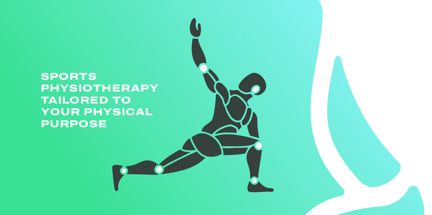

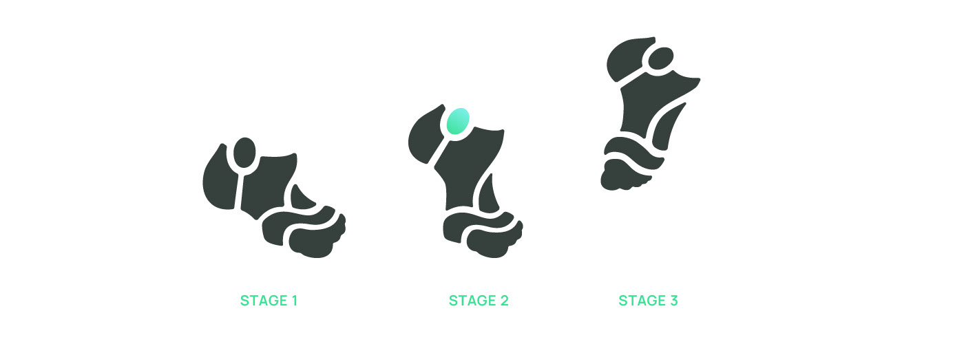
The symbol is the stage in the stepping sequence where the foot of the athlete is just about to get airborne. The tension that this moment captures enhances and puts in the foreground the values of growth and healing upon which we created the brand.

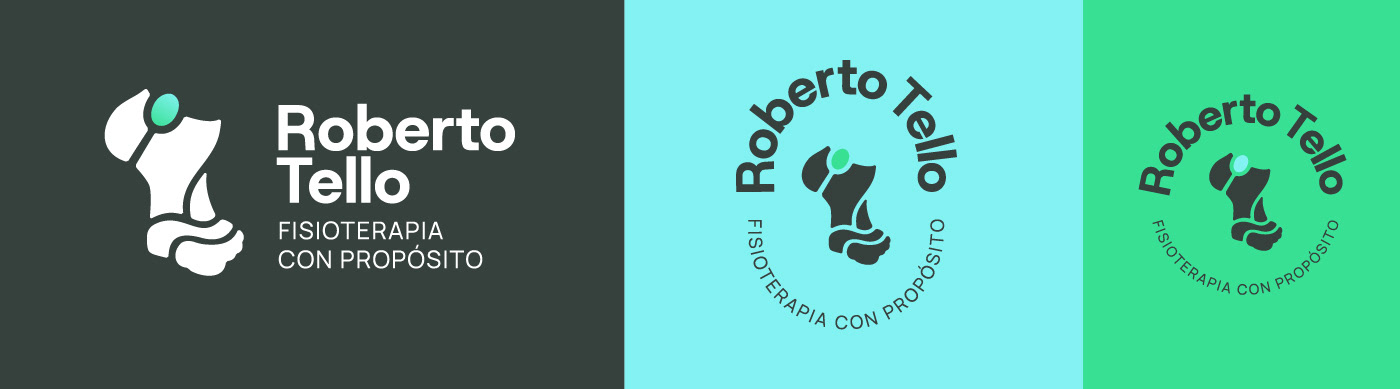
Empathy, real attention and experiencing the higher stakes of professional athleticism shape how Roberto works with his patients. To reflect these values we created a visual language that talks about recovering and health in a sportive tone of voice, making it clear to whom it talks to.


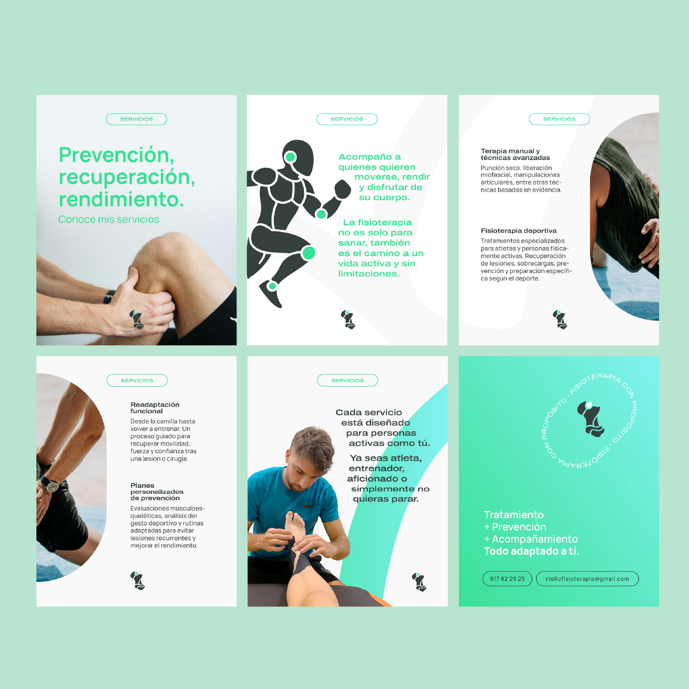
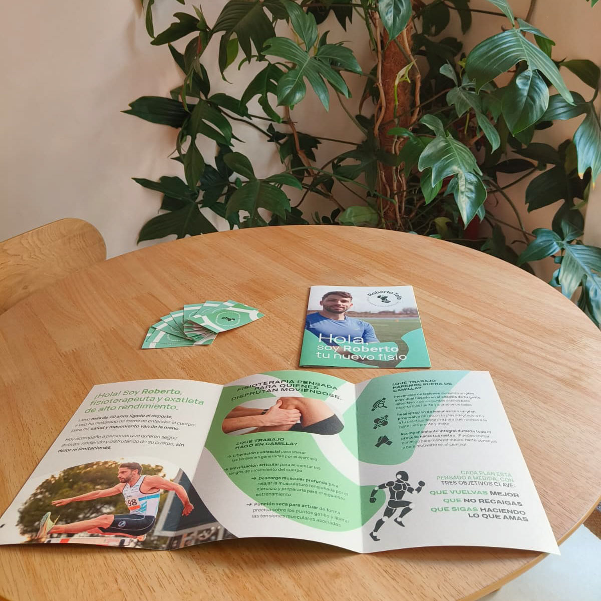
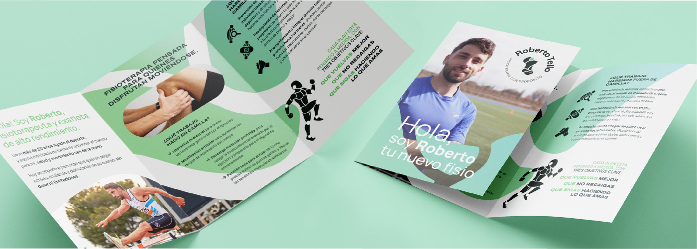
Along with the logo, we created the first promotional materials that were needed. For the brand' digital presence we started with some Instgaram carousel posts explaining the services, values and who is behind it all. We also created a printed brochure to be used and given on site.